

3 principles that all fields of design have in common
3 principles that all fields of design have in common
Design isn’t just “simplicity”
If you could ask your grandfather today what design was, what would he say? “Oh it’s like movie posters right?” “I think the iPhone is well designed”. Or how about “Facebook has a nice design.”
We’ve all heard the names and quotes thrown around. “Design isn’t just beautiful, it works beautifully”. Dieter Rams, “less is more”. Jony Ive. Tim Brown. Don Norman.
Observe, Imagine, Configure. — Roger Martin, The Design of Business
Still — it seems like for most people, the categories of design and the practices established each specific design field are kind of separate. Heck — the quote by Roger Martin is for the design of business. I didn’t know that was even a field. I’ll bet those designers get paid a lot.
A refresher for the people who are confused but won’t admit it
Of course, we all know what design is. It’s painfully simple and I may be insulting some folks for even mentioning that sometimes we need to go back to the basics. But I’m going to do it anyway since a. my writing undoubtedly has your attention, and b. it’ll help make sense of the 3 concepts I’ll highlight later.
Design is the planned creation of an object, product, or system. Art is a noun, design is a noun and a verb. It’s a process more than a product. When something is designed well, it’s just the way it should be — you should feel like there isn’t any other way you’d rather have it. Design, at heart, is a way of thinking. Designers are the people who hone their way of thinking like a craft.
The main point of difference is that of timing. Both artists and scientists operate on the physical world as it exists in the present, while mathematicians operate on abstract relationships that are independent of historical time. Designers on the other hand, are forever bound to treat as real that which exists only in an imagined future and have to specify the ways in which the foreseen thing can be made to exist. — John Chris Jones
For those unfamiliar, hopefully that’s enough just to get you in trouble.
1. Complexity within Simplicity. Not just simplicity
I’m tired of hearing people say design is simplicity. No, the logo is not well designed because it’s simple. The iPhone likewise is not well designed just because it’s simple. I can give you a lump of clay, that’s simple enough. Does that make it well designed?
The objects which we all consider to be well designed are simple because there is an enormous amount of complexity tucked away behind the scenes.
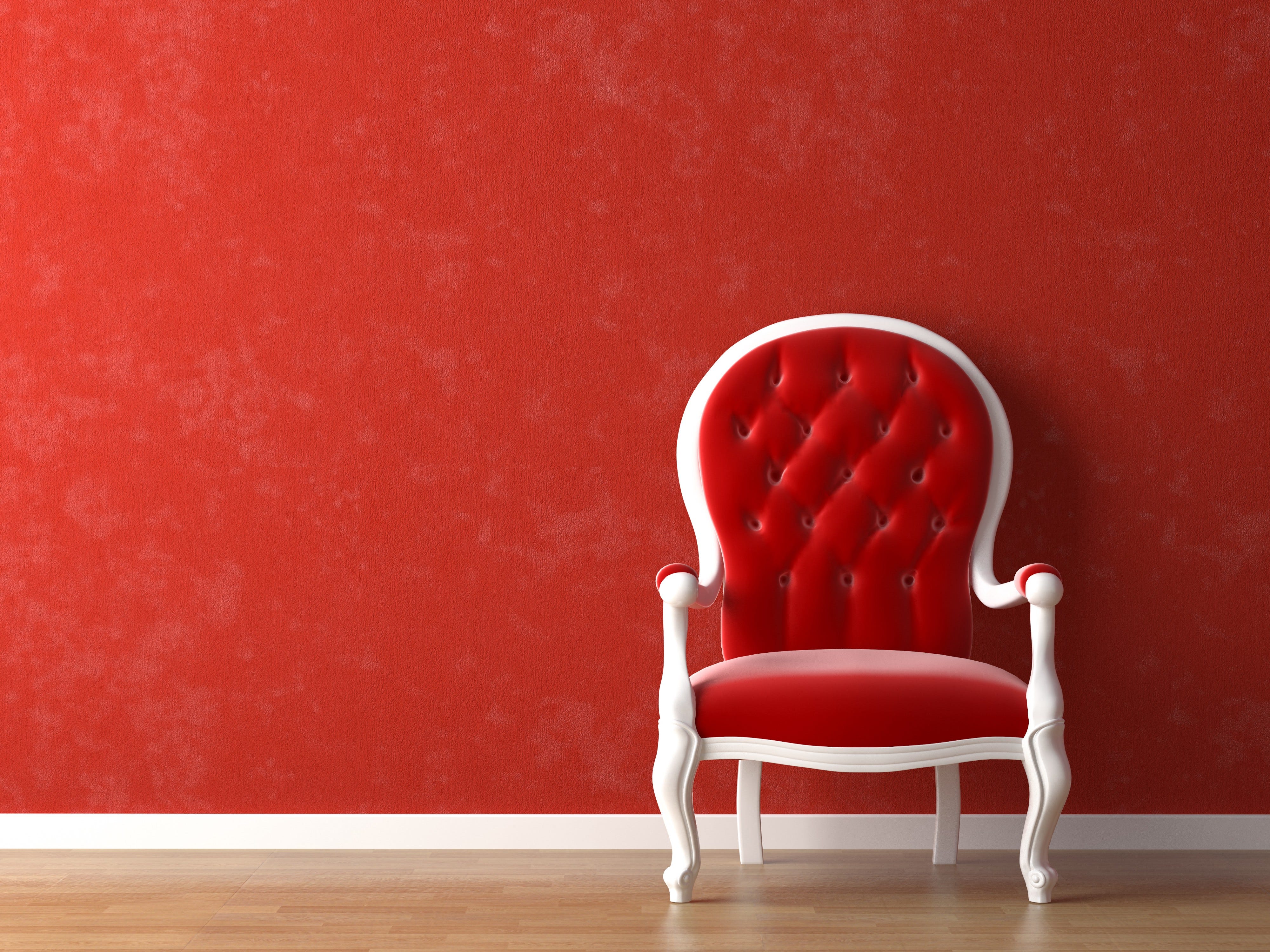
Yes, “Less is More” even applies to Interior Design
It’s the massive amount of utility and complexity that’s underneath the simple interface of an iPhone that makes it well designed. If you’ve ever tried making something incredibly complex simple, you’ll know that it’s actually a lot harder to do than making something complex, well, complex.
If you want me to give you a two-hour presentation, I am ready today. If you want only a five-minute speech, it will take me two weeks to prepare. — Mark Twain
Bah, Humbug
Many folks these days will take notes on tablets. I’m not really that old (or maybe I’m just young at heart) but when I was in school still I remember, even when laptops were around, the majority of the class taking notes on pen and paper. I’m no longer in college though so for all I know kids could be taking notes now on tablets instead. Or pretending to take notes anyway.
Call me old school, but I still prefer pen and paper to a tablet or laptop — even in meetings. It’s not merely because I’m a stubborn scrooge who snubs his nose at kids these days— it’s purely logical. As many wonders as the digital world has given us, the utility of pen and paper (the number of complex functions it puts at our disposal) far surpasses the capabilities of a digital notebook.

How I envision myself taking notes. In reality, I look a lot less hip.
Sure you can save your digital notes, rename them, share them with your neighbor’s dog’s Instagram, etc. but when it comes to the actual note taking itself, digital pales in comparison to paper. With a pen and paper I can write sentences, draw arrows between them, doodle in the margins, draw diagrams, and none of them require me clicking a button to “toggle from draw mode to typing mode”.
In essence, the pen and paper in my mind is a better designed solution, which is why there are many who still prefer it to digital note-taking in Google Docs.
The great enabler
Here’s another way to look at it — design is the great enabler. As a user of the design, I want to access a vast array of complexity, and a design is the gateway between me and my goal. I want to change the default font size on my smartphone — the interface is the design. I want to understand what this Broadway show is about — the poster is the design. I want to express and log my ideas down in the most freeform way possible — the pen and paper are the designed tools to get me there.

In each of these instances, the design can be good or bad. If my pencil squeaks, it’ll irritate me and I’ll be more likely to switch to digital. Or someone may accidentally give an Academy Award to the wrong recipient.
Oops.
The best design enables you seamless access to a lot of complex things. That’s why the best design is simple.
Keep It Simple, Stupid. — US Navy
Hey, even the navy needs designers!
2. Intuitive-ness
“Oh! Well, the iPhone is easy to use. It’s just so intuitive.” — every Apple user asked to justify the ridiculous price tag.
A spoon can be intuitive. A chair can be intuitive. When a design is intuitive, it just feels right. The thing is, intuitiveness is not universal. Believe it or not, a spoon can be unintuitive to certain people. Things that may be incredibly easy to understand and pickup for some might not initially be to others. So how do designers of every field look at intuitiveness as a tool to better improve their designs?
The thing is, the function of a design has to be governed by an underlying natural behaviour to be intuitive. Turning a page on an iPad feels intuitive because even though all you’re doing is flicking your finger on glass, Apple made it seem like you’re turning a real book’s page — something you’ve undoubtedly done/seen many times.
All it really is is the form has to follow the function, as the saying goes. Chris Bangle, famous for defining BMW’s iconic design, said he wanted the interior, exterior and everything about the cars to feel fast. The moment you step inside the car, and it actually goes fast, it feels just right because you’ve subconsciously been conditioned to already expect it.
3. Hierarchy
4473236673
After you read those numbers, without looking, how many could you recite? George A. Miller is famous for publishing a 1956 paper discussing the concept of chunking. His theory detailed that people could digest information easier and remember things better if they were “chunked”.
(447) — 323-–6673
How about now?
The same sort of cognitive science applies to design. We chunk information and order it in the way that would most clearly aid the user in accessing the complexity beyond the design. When I used to have a toaster, it was very clear to me what the most important interactions were — the openings to stick bread in, and the lever to push the bread down.
This concept is everywhere in design if you look for it. The brake pedal in a car is bigger than the gas (guess why). The home button is the biggest button and often on the front of your smartphone. The title of the Broadway show is often the largest text on a poster — because if it wasn’t, a young family may walk into a showing of Chicago thinking they were about to watch Cinderella.
Hierarchy allows you to streamline designs and help users focus on what they need to to be successful. From designing tv remotes to digital apps, we should sort and prioritize the things that require your input to make the designs dummy-proof.
It’s really important in a product to have a sense of the hierarchy of what’s important, and what’s not important, and removing those things that are all vying for your attention. — Jony Ive, Apple
Design is a craft, and the designers need to hone their crafts by ensuring that the most important things are the most easily accessible. If everything stands out, nothing does. That’s why the best designs are often the ones that you never struggle with because they handhold you without you even knowing so.
I’m sure there are more, but these are some of the principles which in my experience apply to all of the different design fields. They apply regardless of whether you’re a graphic designer, an industrial designer — heck, even a design-minded engineer. (beautiful code, anyone?)
The better we get at these 3 principles, the better designers we’ll be, regardless of specialty. Let’s get to it!